You’ve implemented a successful Net Promoter Score survey, with a good response rate and a high NPS score. Congrats! Pop that number on your website, sit back and watch the leads roll in. Right?
Not quite. When NPS surveys don’t lead to action, it becomes a vanity metric that means very little to your business.
How can a customer-focused organization derive value from NPS surveys?
NPS analysis: How do you improve a Net Promotor Score?
NPS surveys can capture an overall trend in customer loyalty, but the results won’t tell you why that trend is happening. This leaves customer service leaders perplexed over next steps, taking stabs in the dark to improve NPS for the next quarter. If we reply to customers faster, will they become promoters? If we reduce our price, will we have fewer detractors? Using only one set of survey results is like trying to catch a ball with one eye closed – you have no perspective.
So how do you decode your NPS results for more meaningful suggestions?
The key is to combine and layer NPS data with other customer metrics to get a more complete picture of your user base.
By charting NPS against customer satisfaction (CSAT) scores or other data, you can easily segment your customers and see which project investments will get you the most return. This will allow you to start with an educated hypothesis of what is driving your customer loyalty and give you the methods to improve it over time.
An example chart:
NPS vs Satisfaction
At Kayako, we record NPS and CSAT scores on an ongoing basis, but we ran into the same problem. Customers with high satisfaction were still churning, and our marketing team wasn’t able to find good testimonials. We’ve layered our NPS and customer satisfaction score data against each other to find some new insights. Here’s how:
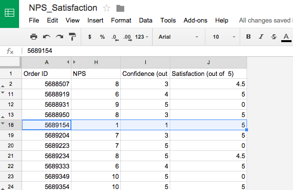
1. Pull data from your NPS surveys and recent satisfaction scores and use your customer or account names to place them with the corresponding survey response. We had to go back about 8 months to get a large sample size (about 700 accounts)
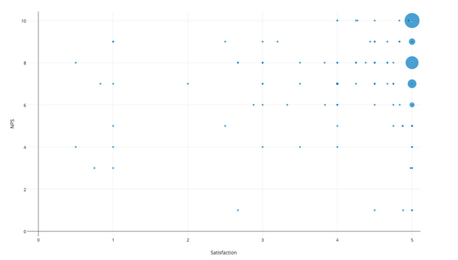
2. Using a grid with two axis, chart customers on both NPS and satisfaction. I used Plot.ly which is a free service and really easy to use. It took me about an hour to make the following plot. This is real Kayako data.
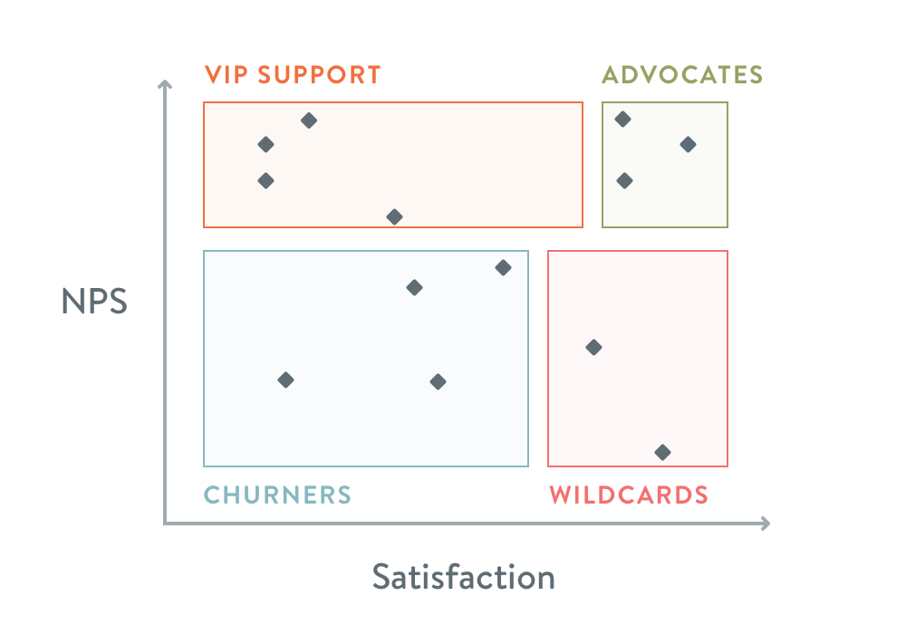
3. Note where the clusters of users are. I’ve divided our chart into the following four sections: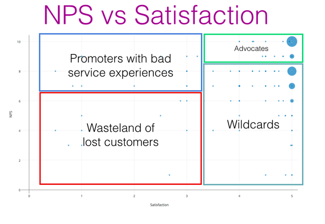
Promoters with bad service experiences
Layering NPS and customer satisfaction scores on top of each other paints an interesting picture of whether your customer support is driving loyalty, or if it’s a possible reason for churn.
We’ve all been to a restaurant where the “service is terrible, but the food makes up for it, so we’ll keep going back” Is this happening in your product? You’ll see a high number of responses with low satisfaction scores, but middling to high NPS responses. To make these customers super promoters, invest in support to improve the experience they have with your support team.
Advocates
These are loyal customers who have also had really great experiences with your support team. They would be a great segment to send to the marketing team for referrals, testimonials and case studies.
If your marketing team was contacting all customers that responded 9 or 10, they’d run into some of the first segment: promoters, but ones that aren’t entirely satisfied.
Wildcard
These “satisfied but disloyal” customers are an important segment of your customer base that you might not otherwise notice without running NPS surveys. Comparing traditional customer satisfaction scores with long-term NPS shines a light on this segment of customers who may have had a good one-time interaction with a support agent, but experienced a rough path to get to that point.
These customers are at a high chance of churning. It can take up to twelve good experiences to overcome the unhappiness caused by one bad experience (source:“Understanding Customers” by Ruby Newell-Legner). Customers don’t easily forget a problem!
These customer are sitting with a high level of product frustration, or not seeing enough value to stay. To keep them engaged, invest in education, product fixes and proactive customer success calls to drive higher value and to help them achieve their objectives.
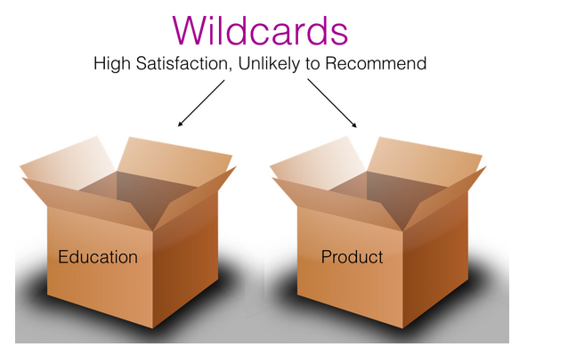
While many companies use exclusively customer satisfaction scores, 60-80% of customers who ultimately churn said they were satisfied or very satisfied in their last CSAT survey – clearly, satisfaction isn’t driving loyalty. Adding NPS scores into the mix helps uncover these quietly unhappy customers.
Wasteland of lost customers
These are customers who are not satisfied, and are not loyal. Of the data we had, about 5% of the accounts were in this quadrant. It’s unlikely we can dramatically impact the business by targeting this segment, so we won’t be digging much further into them.
What’s next?
We’ve started targeting our “wildcards” through customer interviews. Each member of our marketing team is committed to five customer interviews each month to better understand their needs, and to validate the decisions we’ve made about our future plans.
We also have some other similar experiments we want to run:
- NPS vs Product Usage: are our promoters more active than our detractors? Do we have promoters that could be upsold due to not using all of the functionality?
- NPS vs Age of Customer: are our older customers becoming less loyal due to a change in direction in the product?
We’re so excited to keep digging in and learn more about our customer base. Combining qualitative data (like interviews) with better use of quantitative data means we have a much richer pool of data around who our customers are, why they use Kayako, and their needs and frustrations – so we can guide our business and our product in the right direction.
Takeaway:
By charting your NPS scores with other data, you’ll have a much more complete view of the state of your customer base. From here you can clearly target segments of customers to move them up and to the right on these graphs – Highly Satisfied Promoters.
Let us know how you get on with this, we’d love to hear any insights you’ve discovered about your customer base! I’m always happy to answer any questions about the methodology, just drop me a comment below. We’ll also be posting a link to the UserConf talk when it’s made available, so stay tuned. 🙂
This post is based on a talk I gave at UserConf London 2015.